UX/UI Design
Working Against Gravity

Introduction
The Product
Working Against Gravity (WAG) offers personalized nutrition coaching to help individuals improve their nutrition through expert guidance, accountability, and education.
Project Duration
3 Months.
The Problem
The brand's website homepage and service pages weren’t effectively converting visitors into paying members. The design and messaging didn’t clearly communicate the value of their coaching services or guide users toward enrollment.
The Goal
Increase enrollment in WAG’s Personalized Nutrition Coaching by refining the homepage and service pages to be more engaging, user-friendly, and conversion-focused.
My Role
Senior Graphic Designer acting as the UX Designer.
Responsibilities
Rebranding and visual updates to align with WAG’s mission. Redesigning the homepage and service pages for better human-centered experience. Improving content hierarchy and user journey. Creating wireframes and prototypes.
User Research
Summary
Before jumping into design, I wanted to ensure that I was addressing the actual problem and not just putting a bandaid on the issue, so to speak.
For this project, I collaborated closely with marketing consultants who acted as user researchers. They gathered valuable insights from the client, end users, and business owners to help define the platform’s challenges and opportunities.
Pain Points
Overwhelming Layout
The website was cluttered with too much information, making it difficult for users to focus on key content.
Unclear Navigation
Users struggled to find the information they needed due to confusing menus and a lack of intuitive navigation.
Inconsistent Design System
The existing website did not consistently reflect the brand’s mission or engage visitors visually.
Weak User Journey Flow
The website failed to lead users toward conversion points like signing up or learning more about services.
Persona Example

Name
Sarah Johnson
Age
34
Education
BS Marketing Degree
Hometown
Austin, Texas
Family
Married with two kids
Occupation
Marketing Manager
Problem Statement
Sarah is a busy professional and mother who needs a structured nutrition plan with accountability because she struggles to prioritize her health amidst her demanding schedule.
Goals
- Maintain a balanced diet while managing a hectic lifestyle.
- Receive personalized feedback that feels human and motivational.
- Easily visualize her progress over time.
Frustrations
- Lack of time to research nutrition strategies.
- Dislikes lack of human connection in generic, automated feedback systems.
User Journey Map
Sarah’s goal is to find a personalized coaching program that feels tailored to her needs. Her biggest roadblocks are understanding how WAG works, trusting the process, and feeling confident about the investment. The redesigned site needed to walk her through the value clearly and seamlessly guide her to sign-up.

Design Process
Paper Wireframes
The goal for paper wireframes is to map out a clean and intuitive structure for the website with quick iterations and low-effort visualization of the user journey. Admittedly, our team skipped this phase and decided to jump right into the digital wireframes phase for a quicker turnaround.

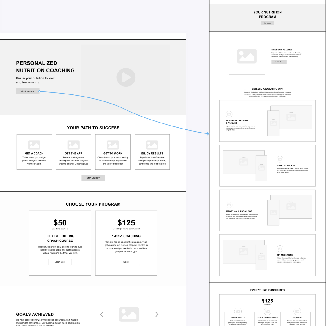
Digital Wireframes
My Thought Process
The digital wireframes were built and prototyped in Adobe XD. This was my first time creating wireframes for a real client and I was able to learn firsthand how critical this step of the process is. A few things I was able to take away:
- Mapping out the user journey in a low-effort, no-visual environment allows for quicker iterations and potential pain points of the flow.
- I was able to pin point areas where the user might become frustrated and make necessary changes.
- I prioritized information architecture, ensuring the most important information (value proposition, testimonials, pricing) is front and center.

Low-Fidelity Prototype
I created a clickable prototype from the built wireframes to test basic user flows. The goal was to see if users could easily navigate to pricing and understand WAG’s core offerings.

Usability Study: Findings
Round 1 Findings
Users wanted pricing to be more prominent, and the call-to-action buttons weren’t standing out enough.
Round 2 Findings
Users appreciated the update to the hierarchy of the pricing content, and CTA buttons were updated for clearer action responses.
Mockups
The UX design process requires a high-fidelity prototype to provide a more detailed, accurate version of the desired design for testing. Our team was not able to include this step in our process due to client restraints, so I was responsible for converting the wireframes into more of a mid-fidelity prototype to hand off to the client.
Outcome
Impact
By refining the website’s hierarchy and optimizing key conversion points, my design helped create a seamless and engaging user experience. A peer noted that the new layout made it ‘easier to navigate and understand the brand’s value instantly'.
What I Learned
This project really reinforced how important it is to nail the UX phase before jumping into UI. I learned that without a solid foundation with clear user flows, intuitive navigation, and well-structured content, even the best visuals won’t fix a poor experience. Taking the time to research, wireframe, and test ideas early on made the design phase so much smoother and more intentional. It also showed me how small UX tweaks can have a big impact on engagement and conversions, making the final design usable, equitable, enjoyable, and useful.
Next Steps
Next Step 1
Spend more time on user research and testing wireframes before moving into high-fidelity design to ensure a strong UX foundation.
Next Step 2
Incorporate feedback throughout the process by running quick usability tests or peer reviews to catch issues early.
Next Step 3
Be intentional about accessibility by considering color contrast, typography, and interactive elements to create a more inclusive user experience.


